Universal Mobile Navigation
UX/UI DESIGN, STRATEGY

Overview
Autodesk owns a complex network of websites, each with its own dedicated purpose, such as Support or Account. All of these web properties were designed and built independently of one another. This has led to inconsistent navigation experiences, especially for users who cross domains and must adjust to multiple UI patterns.
This project focused on creating a navigational ecosystem that is consistent cross-property, with modular elements for customizable headers and menus.
I used an iterative design process to create a framework for Autodesk's mobile menus, including both primary and secondary navigation, spanning five of Autodesk's different web properties.
01 About This Project
The Universal Header project was a multi-team collaboration that impacted every Autodesk web property. The largest obstacle in this project was that each domain was originally developed as an isolated website rather than as part of a larger network that users can traverse. This led to inconsistent cross-property navigation, visual design, and mismatched interaction patterns.
We worked to create a scalable and flexible framework of components that could be used as needed within each site. By sharing search and navigation, we could present one cohesive website with navigation that follows a consistent pattern from domain to domain. This was the first step in ensuring a consistent experience logging into and navigating across our key digital properties.
To create this component library, we divided up the work by individual elements within the navigational ecosystem. Each component would be developed individually and incorporated into a library of elements that could be deployed on a site-by-site basis across all web domains and micro-sites.
Using the RACI system, we had a total of 60 different stakeholders across the company and closely worked with branding and engineering during the process.
Problem Statement
Navigation across the key Autodesk digital properties is inconsistent and potentially confusing. Icons, links, sign-in, notifications, and logo use vary from property to property, which does not support a great customer experience.
Project Details
Redesign of navigation across multiple Autodesk web properties. Work included information architecture, mobile menu design, and codifying a design framework for future improvements.
Project Title: Universal Header Project Phase 1
Time Frame: March - August 2020
Skills Used: Strategy, UI Design, Analytics
My Role
Mobile Menu Interface Design
Designed interaction patterns for all mobile menus within scope (hamburger, waffle, me menu, account, and profile menus).
Contextual Secondary Navigation
Designed UI of site-specific menus for both Account and Profile. Focused on making them functionally consistent, intuitively understandable, and compatible with the new Universal Header.
Primary Navigation
Responsible for all UX work for the cross-property mobile menus, using an iterative design process based on analytics, information design, testing feedback, and stakeholder input.
Research and Analysis
Used both Google and Adobe Analytics to gather current usage data and traffic patterns of our headers and menus. Integrated these metrics with analysis conducted by our data scientist to make key design decisions.
Part of a Larger System
Mobile menus were one element of a larger navigational framework being implemented through this project. I worked with six other designers (each owning the design of one element) and collaboratively we created a system where each component served a singular purpose for helping users navigate a complex patchwork of domains and web properties.
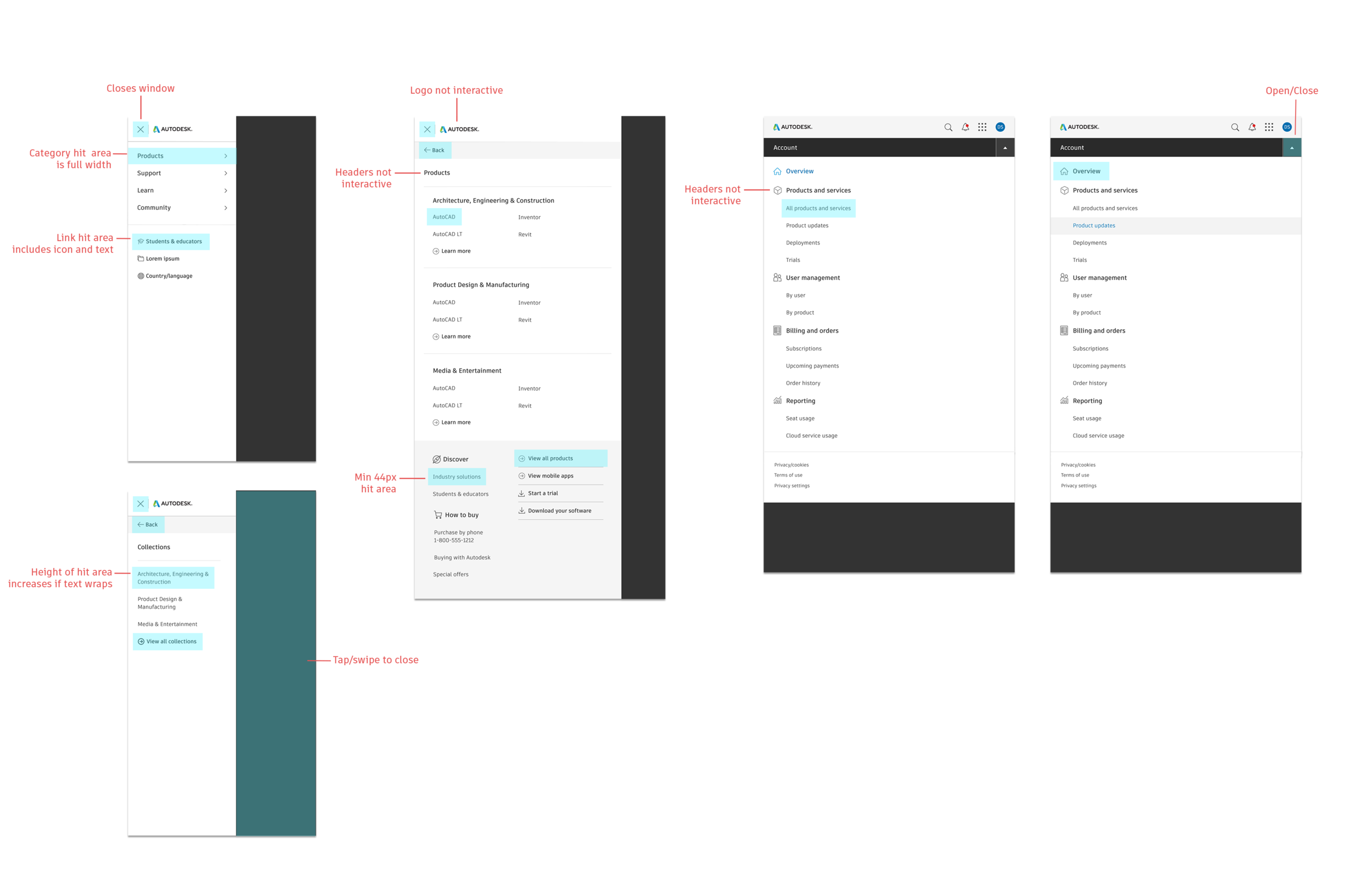
Hamburger Menu
The mobile version of primary navigation, this menu works cross-property and may contain different items from the desktop version.
Search
The search function will be the same across all properties, producing the same results with the same sort and filter mechanisms.

Waffle Menu
Personalized based on subscriptions and entitlements, signed in users can access their web services and storage solutions anywhere.
Me Menu
This menu replaces the “Sign in” button, giving identified users access to gated domains such as Account and Profile.
Cart
This element is the same across all responsive sizes. The cart is only accessible from autodesk.com global website.
Logo
While not current practice, in the new navigation ecosystem, clicking the logo will always bring you back to the homepage.
02 Research
Evaluating the Current State
In the current state, these domains do not appear to be from the same company, or show any consistent patterns for moving through a page. This project focused on creating a navigational ecosystem that is consistent cross-property, with modular elements for customizable headers and menus. Looking across the properties, it’s easy to spot differences. Breaking this down further, there is no consistency in navigational elements, placement, menu design, links, logo use, search functionality, or iconography. You can see previous efforts to “merge” domains by aligning on visual design, but major anomalies remained.

Do We Need All of These Links?
In the current state, there are 187 links total. However, a disproportionate amount of traffic comes from a very small number of links, with the top 25 links accounting for 90% of clicks.
The overall analysis is complicated by a three-level accordion menu and duplicate links in different sections. In the redesign, it is possible that all of these links will be kept, meaning the organization structure of the new hamburger menu would need to account for this worst-case scenario.

Analyzing Traffic Patterns
Desktop vs. Mobile
A majority of our web traffic comes through desktop computers. Approximately 12% of traffic comes from mobile devices across all domains, with an 18% YoY increase in mobile traffic from 2019 to 2020. While mobile traffic is a fraction of desktop traffic, the number of monthly mobile visitors to Autodesk websites is still in the millions.
Cross-Property Traffic
In a continuation of Autodesk’s legacy of each team and domain operating individually, there was no standardization of tools or platforms. While I tried to measure traffic between domains (versus unrelated exits), different teams decided to use different analytic tools, making it impossible to measure the cross-domain traffic.
Key Challenges
Looking across the five key properties, there are four different menu designs. These inconsistencies are not just relegated to the menus themselves, but can also dictate how page content is organized and displayed.
Each menu has unique links necessary for navigating within that website. Some are highly trafficked and others are rarely used and these links may or may not need to be accessible from other places.
Cross-property navigation is difficult and clicking the Autodesk logo produces different results on a site-by-site basis. It is much too easy to get stuck in a loop using the menus and embedded links on all five domains.
There are 200+ links across all four menus. The future number of links is an unknown and changing variable, and so requires a navigation structure flexible enough to include multiple categories and an unspecified number of links.
Screen size, language, and word length can all change from user to user, country to country, and in the signed-in vs. signed-out state. All menus will be localized into 21 languages.
03 Design Process
In creating a design framework, I explored several different configurations. I found no set standard or best practice for the display and functionality of mobile menus beyond a hamburger icon. I saw this as an advantage. With no design standard, I had much more flexibility in choosing the layout and structure that best fit my project’s needs.


Placement
Full top to bottom overlay covering header and content— prevents UI questions that would stem from the users interacting with other elements while a menu is open.
To facilitate easy open/close actions, the “close” icon is to appear on the same side of the screen as the “open” icon.
Autodesk logo is displayed inside the menu to preserve both branding and context.
Interactions
Close the menu by tapping, scrolling, or swiping outside it.
Scrolling is allowed within the menu, but not outside it.
Container animates on open and close
Content animates right-to-left as user clicks down a path and left-to-right going up. The container remains static
Organization
Remove all accordions and use either a list or cascading list structure.
Menus can contain both icon and non-icon items.
Use a double column layout where possible to remove levels within a cascade.
Line breaks are used to differentiate categories and sections.
Creating the Wireframes
Cross-Property Menus
I created two different layouts in my design proposal. The first was a cascading single column menu (reference 320 Product Menus) and the second was a double column that could be viewed on devices with a higher resolution (reference 640 Product Menus). I included a double column menu in my initial proposal as a method of reducing exploration, showing all category items in one view and minimizing number of taps. However, this wouldn’t work in every situation (i.e. the double column would not fit on smaller screen sizes) meaning both layouts are necessary.
All designs were approved by our project lead. In this vein, the 640px double column menu was originally rejected on the grounds that it introduced inconsistency into the design. However, user testing proved the double column menu reduced “pogo sticking” of going up and down cascades searching for a link, and reducing task times by upwards of 30 seconds on average. After these results, the 640px double column menu was approved as part of the final design.

Site-Specific Menus
Our original assumption was to use the same menu UI on all domains, changing content as necessary. Testing showed that users expect a menu with consistent location across pages to also have consistent content, so we established a single hamburger menu for all properties and the scope of my work expanded to include a distinct menu for contextual navigation. Version 3 tested as the most consistent and least confusing option for site-specific navigation when viewed in the context of a larger cross-property system.

Prototype and User Testing
Wireframes were created in Sketch, and screens from all six designers were combined into an InVision prototype that went through remote testing on usertesting.com.
Two different versions of the Product menu were tested. The single column menu produced more confusion and longer task times vs. the double column product menu.
Initial testing results led to the scope of my role expanding to include site-specific contextual navigation. The second video demonstrates the confusions users felt with version 1 of the account menu. Version 3 tested much better, with reduced confusion of what the menu would contain and highest task completion out of the three versions tested.
Results
A larger single-glance menu is easier to use than a cascading menu when users aren't sure where to look.
Different Menus Should Have Different UI
Menus that have different purposes (i.e. in-site vs. cross-site navigation) should behave differently to stay in line with user expectations.
Video #1 User testing of the main hamburger menu (640px product menu version 2) was successful, with users easily discerning between the different navigational elements and no issues or confusion stemming from the UI.
Video #2 When the same hamburger menu UI (but different content) was applied to Profile and Account (640px account menu version 1), testers were confused by the new content because the menu format remained the same. Without any contextual cues that this was a domain-specific menu, testers were expecting the same menu as found on the sales, support, and forums domains.
Design Handoff
The menus were changed based on usability testing and version 3 for each set of wireframes was handed off. Low level product menus for troubleshooting, system requirements, learn, and forums were left with the current design, the only change I made was moving the close button from the right to left corner of the screen. Final concept was delivered to visual design

04 Final Deliverables
Visual Design
The visual design for the mobile menus comes from Autodesk’s recently established visual library.
Redesigning the mobile menus gave us the opportunity to update the visual design of our entire navigation system and bring greater consistency cross-property.